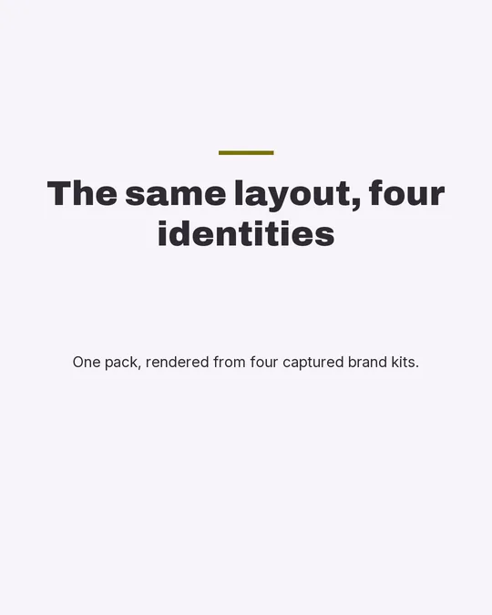
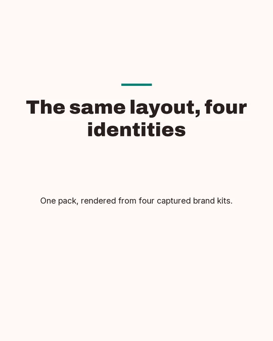
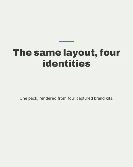
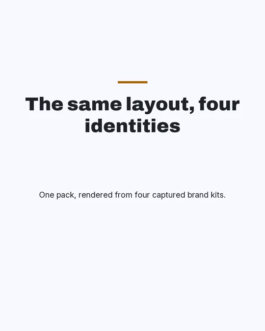
Eight carousel styles, rendered by the thing that renders them.
Every image below came out of Repic’s export renderer, at 1080×1350, from a palette taken from one of our published brand kits. None of it was drawn for this page. That matters because the pages ranking for this query show mock-ups: a designer’s impression of what a template might produce, which you cannot check and which frequently is not what the tool makes.
One thing these renders do not show: they were produced with no slide image supplied, so the three packs that consume imagery (Editorial, Bold, Frame) display the brand-plate fallback (the kit’s own signature-to-black ramp) where generated art would sit. Saying so is the point. A page claiming to show what the imagery packs look like, while showing a fallback, would be the same lie as labelling a substitute typeface with the name of the one that was requested.
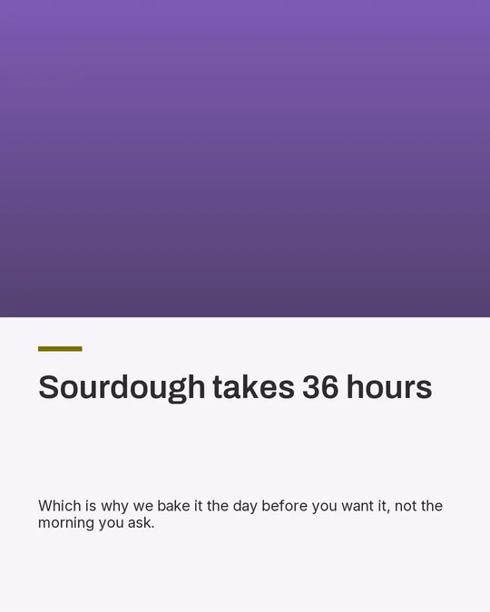
Photo lede on a light page, generous whitespace, left-aligned.
Hook — the first slide, which is the only one most people see
Pick it when
The image is doing real work — a product, a place, a person — and the writing is there to caption it. This is the only pack that gives the picture the top of the slide and lets the type sit quietly underneath.
Do not pick it when
You have no photography worth the space. A lede image slot filled with a stock abstract is worse than a typographic pack, because the layout has committed half the slide to something that says nothing.
Bold
Uses imagery
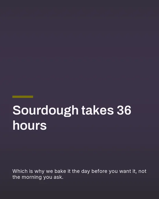
Full-bleed art under a deep scrim with oversized reversed type.
Hook — the first slide, which is the only one most people see
Pick it when
The line is short and the point is confrontational. Reversed type at that size stops a thumb, and the scrim means it works over almost any image without a legibility check.
Do not pick it when
The headline runs long. Oversized type wraps to three lines and the slide becomes a wall, which is the single most common way this pack is misused.
Minimal
Typographic only
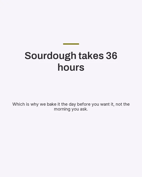
Typographic only — centred, quiet, maximum air. No imagery.
Hook — the first slide, which is the only one most people see
Pick it when
The sentence is the whole asset. Centred and surrounded by air reads as confidence, and it is the pack that survives being screenshotted and reposted, because there is nothing in it that can crop badly.
Do not pick it when
Your feed is already mostly text. Quiet works by contrast; a whole grid of this reads as a newsletter somebody forgot to design.
Signature
Typographic only
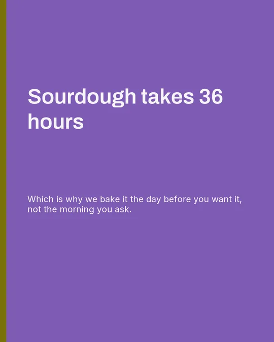
Your brand colour is the page; hard blocking and reversed type.
Hook — the first slide, which is the only one most people see
Pick it when
You want the post recognisable at thumbnail size before a word is read. The whole page being your signature colour is the strongest recognition device available in a feed, and it costs nothing to produce.
Do not pick it when
Your signature colour is low-contrast against white type, or you use this for every post. It is a strong move, and a strong move used constantly is wallpaper.
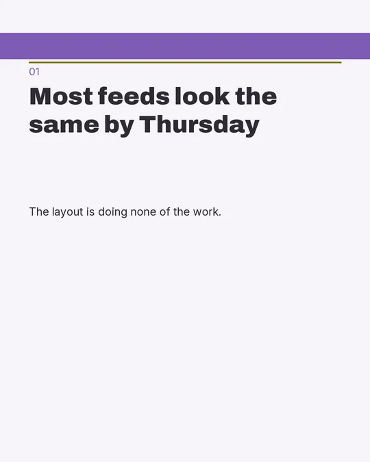
Broadsheet
Typographic only
A two-column grid under a masthead rule. Headline left, body right.
Hook — the first slide, which is the only one most people see
Pick it when
You have more to say than a single line and you do not want to split it across three slides. Two columns take a paragraph without the type collapsing, and the masthead gives the deck a front page.
Do not pick it when
The point is one sentence. Two columns with four words in them reads as a layout looking for content, and on a phone the second column is a thumb-width strip nobody finishes.
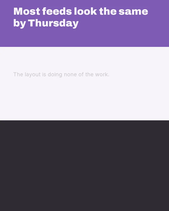
Stack
Typographic only
Horizontal bands — the page divided across, not down.
Hook — the first slide, which is the only one most people see
Pick it when
The slide has two or three parts of equal weight — a claim and its proof, a before and an after. Bands give each one the full width instead of ranking them by vertical position.
Do not pick it when
There is one thing on the slide. A single band with air above and below it is a worse Minimal, and the horizontal division promises a comparison the copy never delivers.
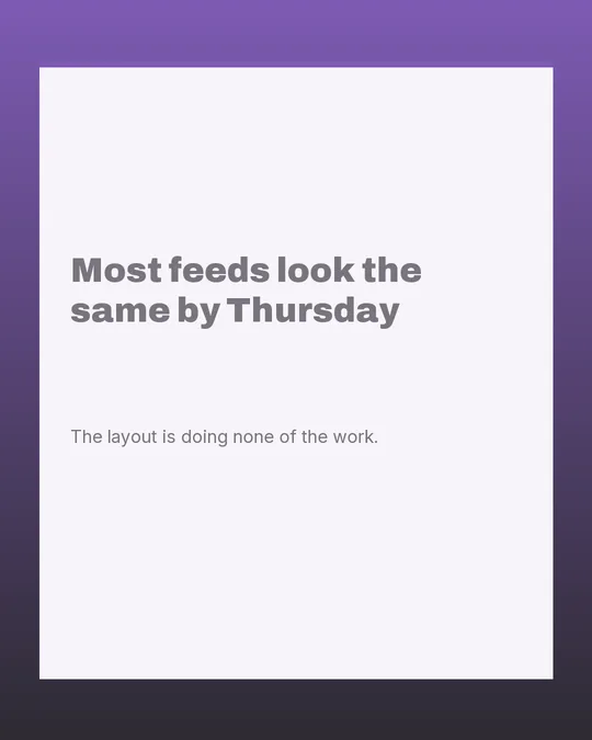
Frame
Uses imagery
An inset plate with the generated art breathing around its edge.
Hook — the first slide, which is the only one most people see
Pick it when
The image is good enough to be looked at but not big enough to survive a full bleed — a product on a plain ground, a detail shot. The inset margin gives it an edge and keeps the crop honest.
Do not pick it when
The image is a wide scene. Insetting a landscape shrinks it twice, once for the plate and once for the phone, and what arrives is a postage stamp with a coloured border around it.
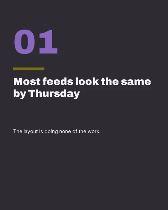
Numeric
Typographic only
An oversized numeral anchors each slide; deck position as design.
Hook — the first slide, which is the only one most people see
Pick it when
The deck is a list and the order matters — five mistakes, three steps, seven rules. The numeral tells a scrolling reader where they are without a progress dot, and it gives every slide the same anchor.
Do not pick it when
The slides are not a sequence. A giant "4" on a slide that is not fourth in anything is a design element pretending to be information, and readers who notice stop trusting the rest of the deck.
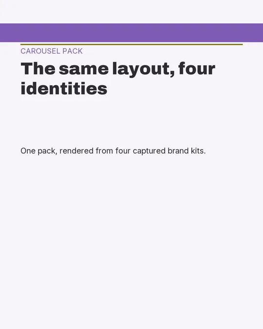
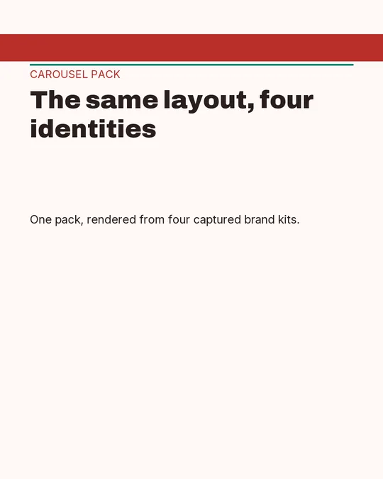
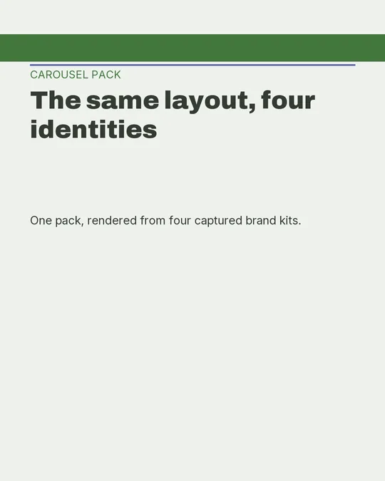
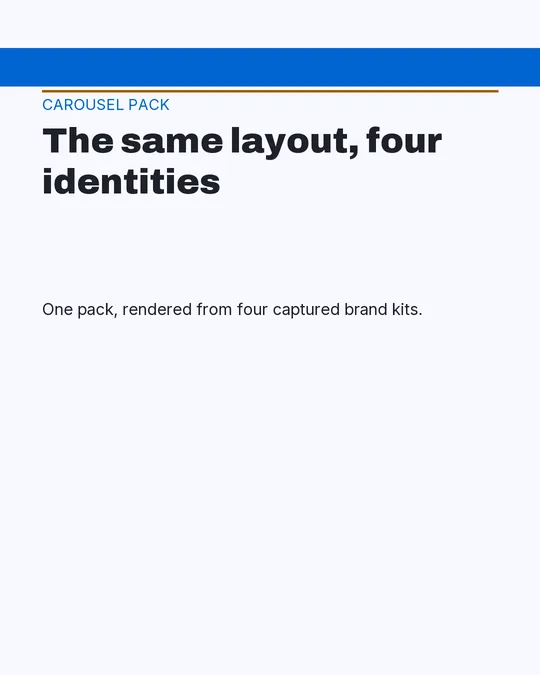
The same pack, four different brands
Every template gallery shows each layout in the gallery's own house colours, because it does not know yours. That makes the one question you actually have, whether this layout survives your identity, the one thing the preview cannot answer, and you find out after committing a series to it.
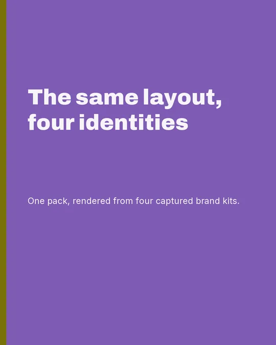
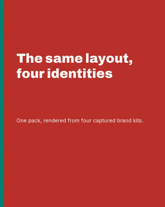
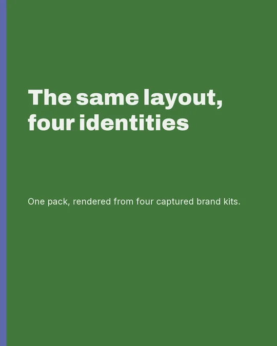
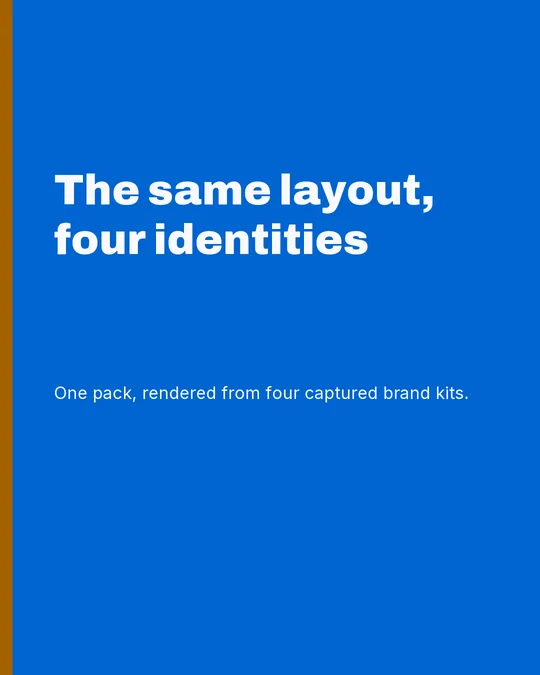
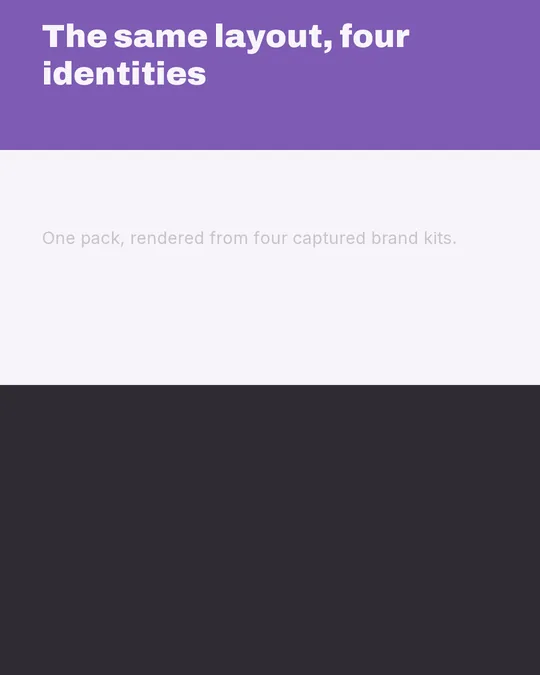
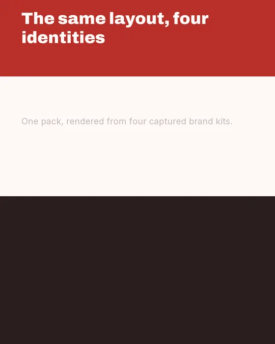
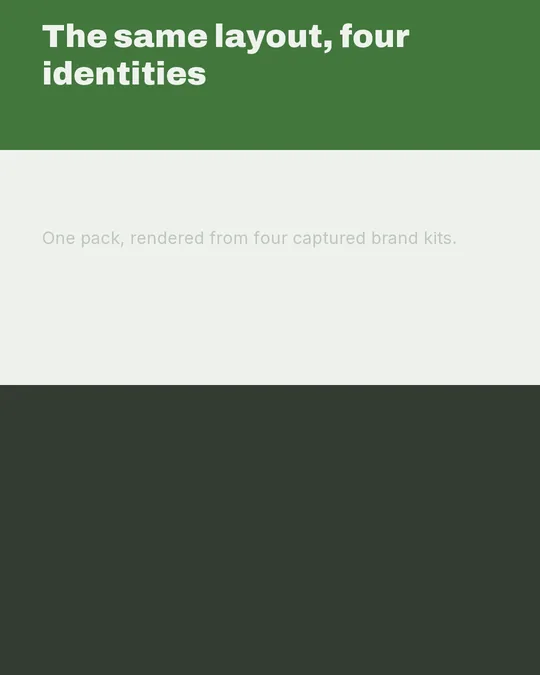
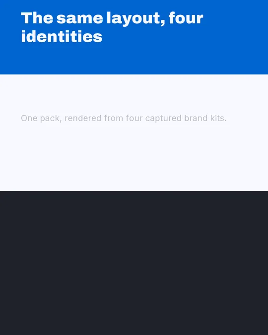
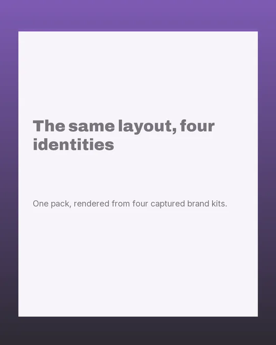
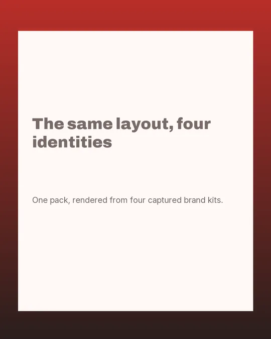
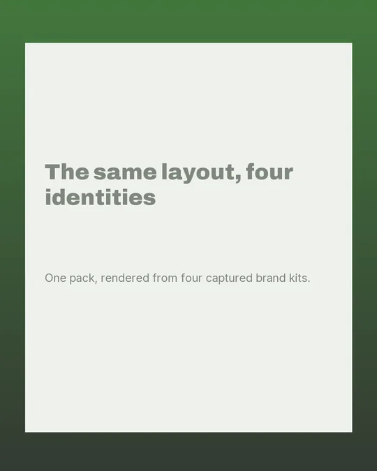
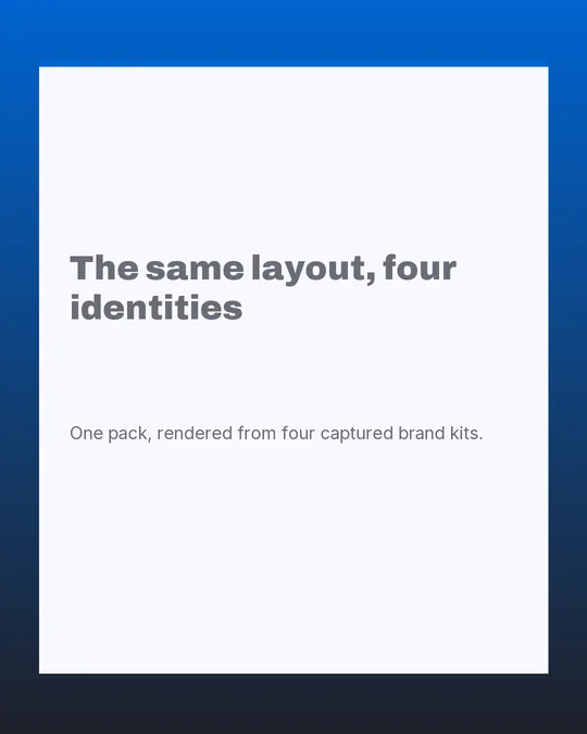
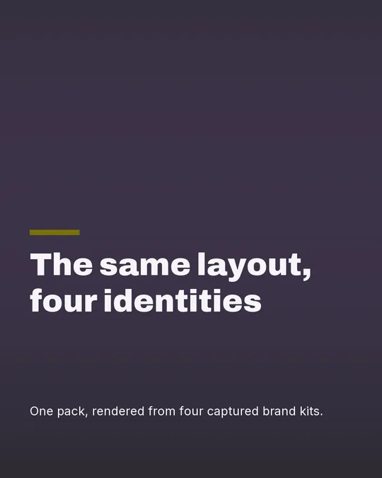
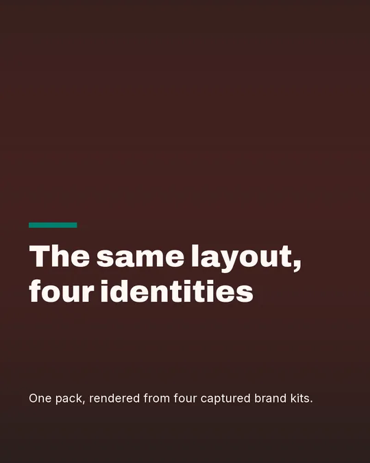
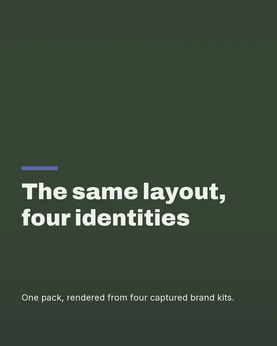
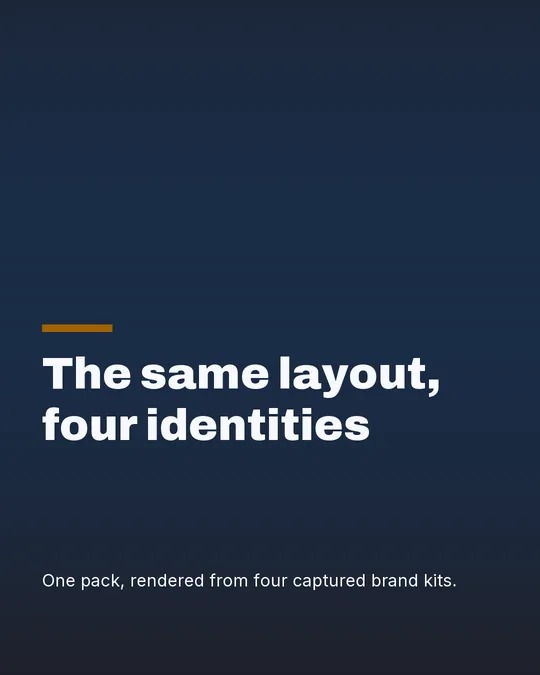
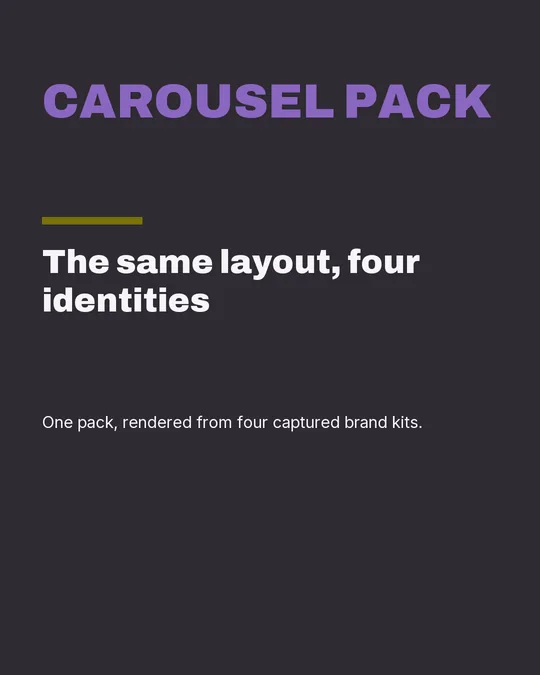
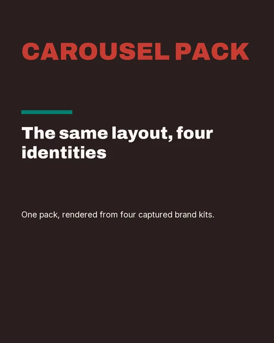
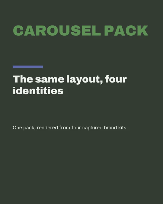
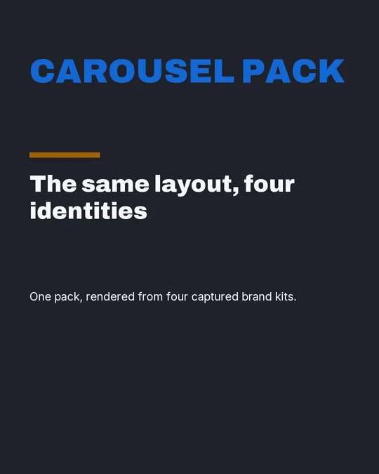
Below is each pack rendered against four captured brand kits from four unrelated trades. Same pack, same slide role, same words. The only variable is the identity, and the four kits were picked for how far apart their signature colours are rather than for looking good together.
They are ordered by how much the layout actually changes, which is measured rather than judged: the mean pixel distance between the four renders. The number is arbitrary in isolation and the ratio is not. Signature carries about ten times more of an identity than Minimal does, and that is worth knowing before you commit a series to one of them.
Signature
carries 157.5
BakerySaaS startupReal estateNutrition
The whole page is the brand colour, so the four renders share a layout and nothing else. This is the pack that makes a post recognisable at thumbnail size, and the number is the reason.
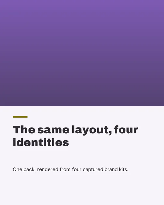
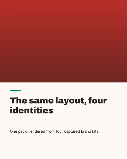
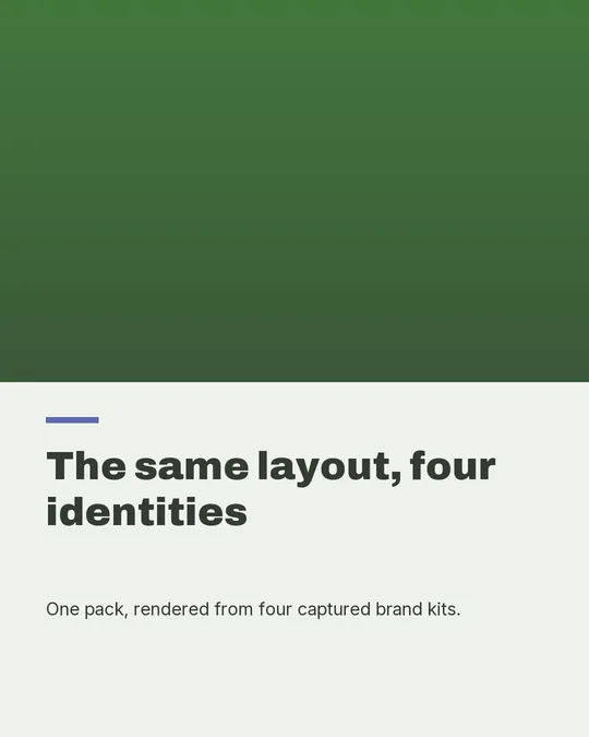
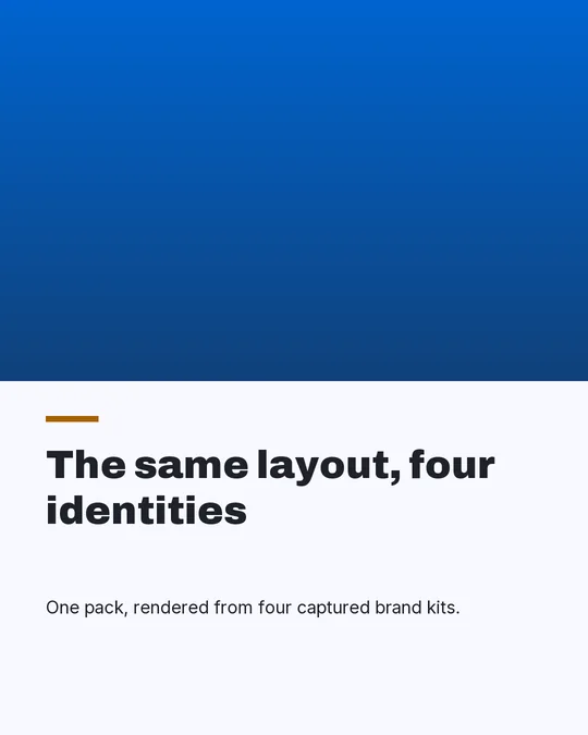
Editorial
carries 71.4
BakerySaaS startupReal estateNutrition
The brand plate behind the lede changes completely, but the light page and the quiet type do not, so the pack reads as the same object in four wardrobes.
Stack
carries 49.5
BakerySaaS startupReal estateNutrition
Second only to Signature, because the bands are brand colour and they run the full width of the page. Dividing across rather than down turns the palette into structure instead of decoration.
Frame
carries 36.7
BakerySaaS startupReal estateNutrition
The margin around the plate is brand colour and the plate is the picture, so identity and imagery each get a fixed share of the slide. That split is why it sits mid-table rather than at either end.
Bold
carries 35.9
BakerySaaS startupReal estateNutrition
Less than you would expect for a pack this loud. The scrim is doing the work, and a scrim is dark whatever colour is underneath it.
Numeric
carries 27.8
BakerySaaS startupReal estateNutrition
The numeral is the largest single element on the slide and it is set in the brand colour, so most of the movement between identities comes from one glyph. Quiet page, loud digit.
Broadsheet
carries 23.3
BakerySaaS startupReal estateNutrition
Quiet, and honestly so — this is a typographic grid, and the identity is carried by the masthead band rather than the page. It first measured 14.7, statistically identical to Minimal, and the pack was rebuilt rather than the number rewritten.
Minimal
carries 14.8
BakerySaaS startupReal estateNutrition
Almost nothing changes. Four brands, one near-white page, and the identity is carried by a single rule and the exact tint of the paper. That is the honest cost of the quietest pack, and it is the reason to alternate it with Signature rather than to build a feed out of it.
Regenerate all 56 with seo-audit/capture/render-pack-brands.py, which reads the palettes straight out of the kit registry and recomputes the numbers above. No image on this page was drawn or retouched by hand.
Why there are eight and not forty
Template galleries compete on count, and count is the wrong axis. Forty templates is four layouts with different placeholder photographs, and the choice it hands you is a browsing problem rather than a design decision.
These eight are different design languages, not variants. Three consume imagery and five are typographic by construction, which is a decision in the layer spec rather than a styling option: the typographic packs do not accept a slide image at all. They also differ in shape and not only in anchor — one is a two-column grid, one divides the page across rather than down, one insets a plate, one makes the deck position a structural element. Every slide is then coloured and set from your own brand kit, so the number of results is 8 multiplied by the number of brands, and the part that individuates the output is the brand rather than the template.
We measured that effect separately: across twenty generated brand kits the signature colour came out different every single time. Eight packs against twenty palettes is not eight looks.
Before you post any of them
Every one of these renders at 1080×1350, which is the 4:5 frame Instagram and LinkedIn both accept. What differs between platforms is what gets covered: profile chrome, captions, and the carousel dots sit on top of your slide, and a headline that clears the bottom edge in the editor can end up behind them.
The carousel safe-zone checker runs entirely in your browser, requires no account, and sends nothing anywhere. It is the one step worth taking before a deck goes out, whether you made it here or somewhere else.
More free tools that need no signup are at /tools, the brand kits these are coloured from are at brand kit ideas, and the rules this page is held to are on our editorial standard.